Creating a Landing Page Optimization Checklist kicks off our journey into maximizing your landing page potential. Get ready to dive into the key elements of successful optimization and design strategies that will elevate your online presence.
Learn how to craft compelling content, master the art of effective CTAs, and ensure your site is mobile-responsive for optimal user experience. Let’s turn your landing page into a conversion powerhouse!
Introduction to Landing Page Optimization Checklist: Creating A Landing Page Optimization Checklist
A landing page optimization checklist is a systematic list of tasks and best practices that are essential for improving the performance and effectiveness of a landing page. It serves as a guide to ensure that all necessary elements are in place to attract visitors, engage them, and ultimately convert them into customers.
Having a checklist for optimizing landing pages is crucial because it helps marketers and web developers stay organized and focused on key objectives. It ensures that no important detail is overlooked during the optimization process, leading to better results and a more user-friendly experience for visitors.
Benefits of Using a Checklist in the Optimization Process
- Improves Conversion Rates: By following a checklist, you can identify and address any weaknesses in your landing page that may be hindering conversions.
- Enhances User Experience: A checklist helps you create a seamless and engaging user experience by ensuring that all elements work harmoniously together.
- Saves Time and Resources: With a checklist, you can streamline the optimization process and avoid wasting time on trial and error methods.
- Provides Clear Guidelines: A checklist offers clear guidelines and benchmarks to measure the success of your optimization efforts.
Key Elements of a Landing Page Optimization Checklist
To ensure that a landing page is optimized for maximum effectiveness, there are several key elements that need to be included in a comprehensive checklist. Each element plays a crucial role in attracting visitors, keeping them engaged, and ultimately converting them into customers.
Clear and Compelling Headline
A clear and compelling headline is the first thing visitors see when they land on a page. It should be concise, attention-grabbing, and clearly communicate the value proposition of the product or service being offered.
- Example: The landing page for Slack features a headline that reads “Where work happens.”
Strong Call-to-Action (CTA)
A strong call-to-action is essential for guiding visitors towards the desired action, whether it’s making a purchase, signing up for a newsletter, or downloading a resource. The CTA should be prominently placed, visually appealing, and clearly worded.
- Example: Airbnb’s landing page includes a prominent CTA button that says “Book now” to encourage users to make a reservation.
Engaging Visuals
Engaging visuals such as high-quality images, videos, or graphics can help capture the attention of visitors and convey information more effectively than text alone. Visuals should be relevant to the product or service and support the overall message of the page.
- Example: The landing page for Apple’s iPhone features high-resolution images of the product from different angles to showcase its design and features.
Concise and Persuasive Copy
Well-crafted copy that is concise, persuasive, and focused on the benefits of the product or service can help build trust with visitors and encourage them to take action. Copy should be easy to read, scannable, and free of jargon.
- Example: The landing page for Dropbox uses clear and concise copy to explain the benefits of the service, such as easy file sharing and collaboration.
Design and Layout Considerations
When it comes to designing a landing page, the layout plays a crucial role in capturing the visitor’s attention and guiding them towards the desired action. A well-thought-out design can significantly impact user experience and ultimately improve conversion rates.
Best Practices for Designing the Layout
- Keep it clean and clutter-free: Avoid overwhelming visitors with too much information or unnecessary elements.
- Use visual hierarchy: Guide the eye towards the most important elements like headlines, call-to-action buttons, and key information.
- Mobile responsiveness: Ensure your landing page is optimized for mobile devices to cater to users on the go.
- Whitespace utilization: Give elements room to breathe, making the page visually appealing and easier to navigate.
How Design Elements Impact User Experience and Conversion Rates
Design elements such as color scheme, typography, images, and overall aesthetics can influence how users perceive your brand and interact with your landing page. A visually appealing layout can build trust, convey professionalism, and encourage visitors to take action.
Tips for Optimizing Visual Appeal
- Choose a cohesive color palette that reflects your brand and creates a harmonious visual experience.
- Use high-quality images and graphics to grab attention and enhance the overall look of the page.
- Consistent branding: Ensure that your landing page design aligns with your brand identity for a seamless user experience.
- Test different layouts and design elements to see what resonates best with your target audience and drives conversions.
Content Optimization Strategies
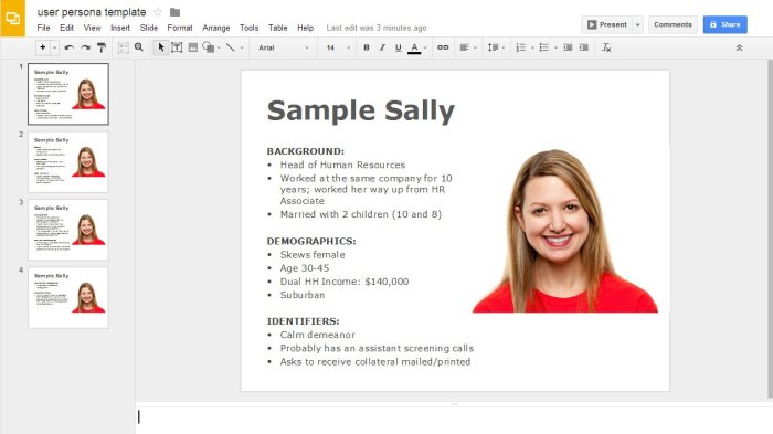
Creating compelling and engaging content for a landing page is crucial for capturing the attention of visitors and encouraging them to take action. The content on a landing page should be clear, concise, and persuasive to effectively communicate the value proposition of the product or service being offered.
Importance of Clear and Concise Messaging, Creating a Landing Page Optimization Checklist
Clear and concise messaging is essential for ensuring that visitors understand the purpose of the landing page and what action they are expected to take. Using simple language and avoiding jargon can help make the content more accessible and engaging for a wider audience.
- Use a strong headline that clearly conveys the main benefit or solution offered.
- Keep paragraphs short and to the point to maintain the reader’s interest.
- Highlight key points using bullet points or numbered lists for easy readability.
- Avoid cluttering the page with unnecessary information or distractions that may confuse visitors.
Effective Content Optimization Techniques
To optimize content for a landing page, consider the following strategies to make the messaging more compelling and persuasive:
- Utilize persuasive language to create a sense of urgency or exclusivity, encouraging visitors to take immediate action.
- Incorporate customer testimonials or reviews to build trust and credibility with potential customers.
- Include visually appealing images or videos that support the content and help communicate the benefits of the product or service.
- Create a strong call-to-action (CTA) that clearly directs visitors on what steps to take next, such as signing up for a free trial or making a purchase.
Call-to-Action (CTA) Implementation
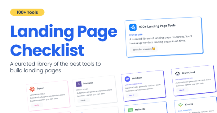
Creating an effective call-to-action (CTA) on a landing page is crucial for driving conversions and guiding visitors towards the desired action. The placement, design, and wording of CTAs play a significant role in capturing the attention of users and encouraging them to take the next step.
Placement, Design, and Wording Considerations
When it comes to CTAs, placement is key. Make sure your CTA stands out prominently on the page, whether it’s above the fold or strategically positioned throughout the content. Design-wise, choose colors that contrast with the background to make the CTA button pop. Additionally, keep the design clean and simple to avoid distractions.
As for the wording of your CTA, be clear and concise. Use actionable language that prompts users to act, such as “Sign Up Now” or “Get Started Today.” Avoid generic phrases and instead, focus on the specific benefit users will receive by clicking on the CTA.
Testing and Optimizing CTAs
Testing different variations of your CTA is essential for optimizing conversion rates. A/B testing can help you determine which design, placement, or wording resonates best with your audience. Consider experimenting with different colors, fonts, sizes, and even the surrounding content to see what drives the most clicks.
Remember to track the performance of each CTA variant and analyze the data to make informed decisions about which elements are most effective. Continuously testing and refining your CTAs will ultimately lead to improved conversion rates and a more successful landing page strategy.
Mobile Responsiveness and Page Speed
Mobile Responsiveness in landing page optimization is crucial in today’s digital landscape where users access websites through various devices. A mobile-responsive design ensures that the landing page adapts to different screen sizes, providing a seamless user experience.
Page speed plays a significant role in user experience and rankings. Slow loading times can lead to higher bounce rates as users tend to abandon sites that take too long to load. Additionally, search engines like Google consider page speed as a ranking factor, affecting the visibility of the landing page in search results.
Strategies for Ensuring Fast Loading Times and Mobile-Friendly Design
- Optimize Images: Compress images to reduce file sizes without compromising quality.
- Minimize HTTP Requests: Combine CSS and JavaScript files to reduce the number of server requests.
- Enable Browser Caching: Set expiration dates for static resources to reduce loading times for returning visitors.
- Implement AMP (Accelerated Mobile Pages): Create lightweight versions of landing pages for faster loading on mobile devices.
- Use Responsive Design: Ensure that the landing page layout adjusts to different screen sizes for optimal viewing experience.

